|
|
|
 |
 |
|
|
Category: typography
|

|
|
|
Psalm surprise
Posted on 05 April 2012, 5:29
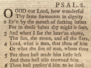
Visiting relatives in Warwickshire on Sunday, I was handed a lovely old copy of the Prayer Book, with a publication date of 1760 on the title page. I dipped in, marvelling that Morning Prayer 250 years ago is exactly as I’ve experienced it myself – except that the letter ‘s’ is frequently shown as a ‘f’ (or a character very like an ‘f’), in that fweet old 18th century ftyle.
It’s not often that my mouth hangs open in slack-jawed astonishment, but when I turned to the back of the book, with its section of metrical Psalms, I encountered Psalm 8 in a version I’ve never seen before (and which I snapped above). The first few lines tell the story.
Now I know 18th century congregations could easily read an ‘f’ as an ‘s’ and would be able to sing the Psalm without any difficulty… but they also knew and loved the same Anglo-Saxon words we cherish today. And so surely, surely, even the most pious worshipper would have sprayed their communion wine over the pew in front when they read these words?
Comment (11) |
|
|
|
|
|
|
|
|
FontBook meets iPad
Posted on 04 August 2011, 21:57
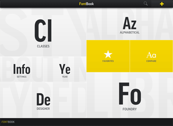
I’ve owned (ok and treasured) a copy of FontBook, the world’s best catalogue of typefaces, since its 1993 edition. There’s something strangely beautiful and reassuring about the rational world of type, and FontBook is a book of endless exploration and even consolation for a typography freak like me.
The book not only displays over 8,000 fonts, but also provides historical references such as dates and creators for each typeface. One of its editors is the legendary Erik Spiekermann, creator of FF Meta and Officina Sans, who writes Spiekerblog.
The huge amount of information in FontBook is perfect for translation to iPad, and this has now been fabulously realised in the FontBook app, launched a few days ago. I’m just starting to use the app, but it apparently features over 620,000 typeface specimens from 110 type foundries.
You can delve into fonts by alphabetical listing, by class (serif, sans, script, display, etc.), by designer, foundry and even year. I’ve really enjoyed using the year lookup, finding out the ritzy typefaces that were hot in the late 50s, for example.
At £3.99 (or $5.99) from iTunes, this is an education and an entertainment at an amazing price.
Comment (0) |
|
|
|
|
|
|
|
|
Crossover design?
Posted on 04 August 2010, 22:24
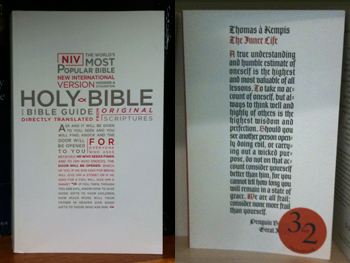
In Blackwells yesterday I came across a paperback edition of the New International Version of the Bible – a veritable brick, bigger than an airport blockbuster. I liked the cover, though (which I snapped, above left), with the type set in the shape of a cross, the lower half being an extended quote from Jesus: ‘Ask and it will be given to you…’
The type, which is a variation of Gill Sans, is physically impressed into the paper, like old-fashioned letterpress, which makes me think the designer has taken a leaf out of the Penguin Great Ideas series, which also features impressed type. Just a few steps away from the bookshelf where I saw the Bible was a copy of the Penguin edition of The Inner Life by Thomas à Kempis (above right), looking like it came out of the same design studio.
Comment (0) |
|
|
|
|
|
|
|
|
Typographic tango
Posted on 16 July 2010, 3:29
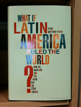
Winner of the Book Cover of the Week competition (Latin section)... as snapped in Foyles on Charing X Road today. Also here.
Comment (2) |
|
|
|
|
|
|
|