Psalm surprise
Posted on 05 April 2012, 5:29
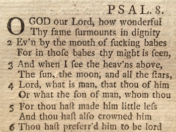
Visiting relatives in Warwickshire on Sunday, I was handed a lovely old copy of the Prayer Book, with a publication date of 1760 on the title page. I dipped in, marvelling that Morning Prayer 250 years ago is exactly as I’ve experienced it myself – except that the letter ‘s’ is frequently shown as a ‘f’ (or a character very like an ‘f’), in that fweet old 18th century ftyle.
It’s not often that my mouth hangs open in slack-jawed astonishment, but when I turned to the back of the book, with its section of metrical Psalms, I encountered Psalm 8 in a version I’ve never seen before (and which I snapped above). The first few lines tell the story.
Now I know 18th century congregations could easily read an ‘f’ as an ‘s’ and would be able to sing the Psalm without any difficulty… but they also knew and loved the same Anglo-Saxon words we cherish today. And so surely, surely, even the most pious worshipper would have sprayed their communion wine over the pew in front when they read these words?
|
Comments
The long s in print was adapted from the long s in handwriting. It was used at the beginning of a word and within a word but never at the end of a word. The cross stroke is not the same as in f. German ß is a version of ss in old style. By the way, Simon, fuck is not an Anglo-Saxon word. It came into English in the 16th century.
Brian, Wed 11 Apr, 17:12

Nerdily, you’re right, Steve. There’s a column to the right which has the second half of each line. If you’re craving the full metrical psalm for your own devotions, just let me know.
Simon, Fri 6 Apr, 05:03
I got one of those annoying captcha anti-robot prompts the other day.
You know the kind: type these two words to proceed.
The first one was ‘almoft’. That’s of course the best I can do at this keyboard—it actually appeared as a ligature.
I passed the test, but I thought it was a pretty high bar to participation.
Breen, Fri 6 Apr, 00:03
I’m not so sure that every well-brought-up 18th- or 19th-century church-goer would recognize the word. I’d be surprised if it was a regular part of most people’s vocabulary before the second half of the 20th century – that’s not to say it wasn’t used by some people, but I doubt if it was used before then with anything like the same frequency it’s used today.
Geraldine, Thu 5 Apr, 23:39
Nerdily – there’s something missing, isn’t there? Does each line carry over onto the right hand page or something? They seem to stop in mid flow. (Awesome find of course.)
Steve Tomkins, Thu 5 Apr, 22:04
Considering the fact that quite a few people who sing in church would not recognize a long s if it were tattooed across their foreheads, I could see it adding a certain je ne sais quoi to the Ascension Day festivities.
Annie Shepherd, Thu 5 Apr, 20:51
You may also be interested to know that “burn” in a sans serif face looks a bit like “bum”.
Ben, Thu 5 Apr, 19:55
Some people just fuck the humour out of everything don’t they?! Great post Simon – I’ll be singing this Psalm all Easter.
KB, Thu 5 Apr, 18:48
Why was the use of long S discontinued? Maybe it was because of ambiguities such as this. I’d be interested to know what was said about the reasons for dropping it at the time, if anyone knows.
Simon, Thu 5 Apr, 16:39
Sorry, but no they wouldn’t (spit their wine over the pew in front). They would have seen it as naturally as you see @. And they wouldn’t have had any problems with the thorn Y either.
John Green, Thu 5 Apr, 16:24
It’s not an F, it’s a ‘long S’. There are very many pairs of letters whose difference are very slight, but we are trained to see them as different, so the confusion (or humour) never arises!
Ben, Thu 5 Apr, 16:06
Add your comment
|