|
|
|
 |
 |
|
|
Category: design
|

|
|
|
Google heaven
Posted on 02 April 2013, 23:48
Descriptions of heaven are really hard to come by. Angels sitting on clouds strumming harps, or St Peter in a comedy beard ticking off names in a big book next to the pearly gates – these are the best known versions of heaven from the world of cartoons.
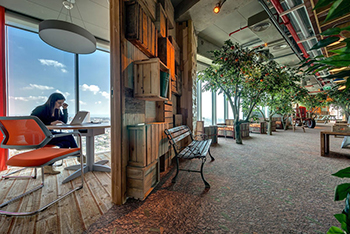
But I realised today why the Bible is so coy about providing a description of the life hereafter. It struck me with the force of full-blown revelation as I scrolled through the newly-released pics of Google’s new offices in Tel Aviv.
The offices include fruit trees, cafe seating made from motor scooters, a flume slide connecting floors, rafts of hanging flowers, stuffed armchairs, beach loungers, table football, wicker sofas, surfboards and pinball – and all with epic views from high above Tel Aviv. It’s rather a male vision of office heaven, but I wouldn’t complain about working there.
I think it’s a mistake though for Google to post the pics. It can only spread general misery about everyone else’s office arrangements. It’s a bit like that old saying, ‘When I heard about your amazing new job, a little part of me died.’
And maybe that’s why the Good Book leaves off the glowing descriptions of heaven. Love, not envy, is what God aims for.
Comment (0) |
|
|
|
|
|
|
|
|
Day-glo believer
Posted on 04 December 2012, 19:14
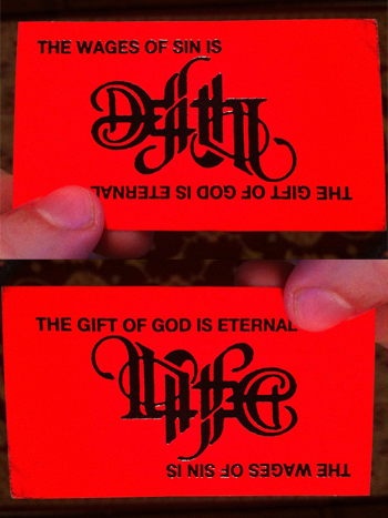
I couldn’t help being guiltily delighted by this evangelistic business card which I found on Reddit atheism this morning (thanks be unto rchayes89 for snapping and then posting it). In fact, I love it almost as much as I love my Barry Manilow record collection.
The card, which puts the cheese back into ‘Jesus’, is brilliant on so many levels. There’s the day-glo red card and the budget heat printing which dollops shiny black ink on the surface – both so 1970s. But best of all is the reversible type in the middle, straight out of the School of Heavy Metal. It’s tacky. It’s cheap. It’s in your face. What’s not to love?
From the scuffed edges of the card, it looks like this has been given back a few times. Which is a shame. I’d endure a 20-minute ear-bashing from a street evangelist just to get one.
P.S. Just to be clear, that Barry Manilow reference was ironic, OK?
Comment (0) |
|
|
|
|
|
|
|
|
Godbaby
Posted on 05 September 2012, 5:05
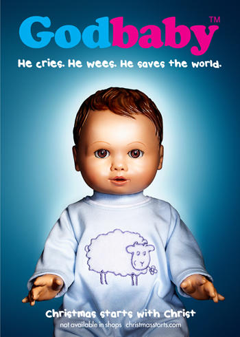
I’m a member of the team behind ChurchAds.Net, which has been producing national advertising campaigns for Christmas and Easter in the UK for almost 20 years. We’ve been running our ‘Christmas starts with Christ’ campaign for the past three Christmases, and the 2012 poster, featuring Godbaby, was launched yesterday. In the week or two leading up Christmas Day, Godbaby will be up there on billboards and bus shelters and outside local churches.
The poster comes with a choice of straplines. For a no-nonsense take on the incarnation, there’s ‘He cries. He wees. He saves the world.’ But for the faint of heart, which will probably include some churches, there’s the alternative version: ‘The gift that loves you back’. See both versions here.
I admire the poster for doing two things. First for talking in the language of today. During the autumn, advertising on buses, billboards and TV screens will be full of toys and products promising to make Christmas better. This poster will raise the same expectation, but it points to the Bethlehem baby as the one thing that can save us. And it undercuts commercial Christmas by saying in effect, ‘It’s not products you need, but Godbaby’.
Second, I appreciate its strong take on the God who becomes one of us to the point of bodily functions. For me, ‘He cries. He wees’ is a brilliant and unexpected connection between the world of dolls, where the hair ‘really grows’, and the world of the Christian faith, where God really becomes a living, breathing, crying, sneezing, weeing human being.
Some Christians will heartily dislike the boldness of that, which they’ll argue is irreverent or even blasphemous. In fact, hostile comment has already started to arrive, with someone emailing to call the poster ‘awful and repulsive’. That’s fair enough, as all Christians are entitled to have strong feelings about how their faith is publicly portrayed.
What do you think? Do you like the poster for its risk-taking attempt to communicate Jesus today? Do you disagree with it for portraying the Son of God as a plastic doll? Or what?
Comment (3) |
|
|
|
|
|
|
|
|
Holy haute couture
Posted on 10 May 2012, 18:43
In the most surreal moment of my year so far, I took a trip down a catwalk yesterday at the Christian Resources Exhibition, which is a sort of Ideal Church Show.
The exhibition features everything a church could need, from bells and steeples to gospel puppets and motorcycle hearses, and whenever I’ve been there in past years, it’s been a happy hunting ground for holy hardware in every shape and form, with the Floating Cross Boxers somehow sticking in the mind. I snapped a few trinkets yesterday.
We ran a stall for Ship of Fools at the exhibition a few years back and served visitors to the stand rum and pineapple cocktails from a Baptist communion glass tray. Happy days.
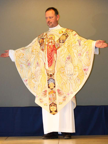
But yesterday, the exhibition staged a fashion show called Clergy on the Catwalk, where a collection of haute couture vestments was taken for a swish along the runway before an admiring audience. Which is how I got to dress up in a crisp white cassock alb and put myself about a bit in three ecclesiastical creations.
The first piece was a stole featuring the 12 apostles in richly dark embroidery from Jackie Binns. The last piece was a very comfortable cope (which I guess is a sort of bishop’s overcoat) in glowing red and gold by Juliet Hemingray... and for that I got to fling a thurible about while the front rows scattered for cover.
The second piece was the crowning glory, however, and was a chasuble hand embroidered with minutely detailed images from oil paintings, by Vanpoulles. I’ve never been greeted with lots of people saying ‘oooh’ and ‘wow’ as I walk into a room, so that was a nice change. That’s me in it in the picture above, just after I was cleared by air traffic control for takeoff.
I noticed last year at the Royal Wedding that some of the most glittering frocks in the house belonged to the Dean and Bishops greeting the Queen at the door, and I’ve often wondered how these fabulous creatures feel as they float around. So thanks to the three design houses for letting me find out for just a few minutes yesterday.
Photo: Laurence Cremetti
Comment (3) |
|
|
|
|
|
|
|
|
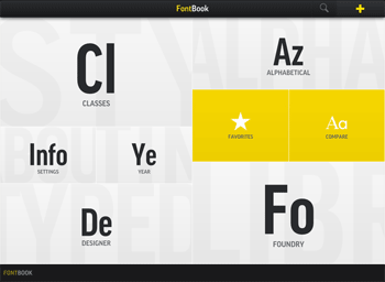
FontBook meets iPad
Posted on 04 August 2011, 21:57
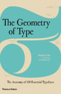
I’ve owned (ok and treasured) a copy of FontBook, the world’s best catalogue of typefaces, since its 1993 edition. There’s something strangely beautiful and reassuring about the rational world of type, and FontBook is a book of endless exploration and even consolation for a typography freak like me.
The book not only displays over 8,000 fonts, but also provides historical references such as dates and creators for each typeface. One of its editors is the legendary Erik Spiekermann, creator of FF Meta and Officina Sans, who writes Spiekerblog.
The huge amount of information in FontBook is perfect for translation to iPad, and this has now been fabulously realised in the FontBook app, launched a few days ago. I’m just starting to use the app, but it apparently features over 620,000 typeface specimens from 110 type foundries.
You can delve into fonts by alphabetical listing, by class (serif, sans, script, display, etc.), by designer, foundry and even year. I’ve really enjoyed using the year lookup, finding out the ritzy typefaces that were hot in the late 50s, for example.
At £3.99 (or $5.99) from iTunes, this is an education and an entertainment at an amazing price.
Comment (0) |
|
|
|
|
|
|
|
|
Devotion by design
Posted on 31 July 2011, 23:28
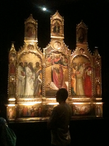
I skipped church this morning and went to see the National Gallery’s Devotion by Design exhibition instead. It wasn’t a bad swop, as the exhibition is about Italian altarpieces from before 1500, and these amazing creations were presented in darkened rooms with the sound of liturgy and music in the background… all very atmospheric.
The exhibition, which runs until 2 October, is quite ‘how to’. That is, it’s very interested in how these multi-image pieces were constructed, allowing you to poke around behind two huge altarpieces to see the carpentry beneath their glittering, golden faces, and the surgery they have endured over the centuries.
One room explains how the people who commissioned and paid for the altarpieces imposed their own choice of saints and sacred stories on the artist. If there was more than one institution commissioning the piece, then the haggling over the cast list of who should appear in the picture could go on for a very long time.
What I missed was a good explanation of the role of altarpieces in church worship, or their impact on the ordinary worshipper. After all, in the age before television and giant advertising images, these pictures must surely have had huge impact, especially as they were positioned so you were looking right at them during the high point of the eucharist. The hyper-realism of some of the painting also draws you into an encounter, despite yourself, with the saints shown there.
I leafed through the exhibition catalogue in the shop afterwards, and it had good material on the place of altarpieces in the church’s liturgy, so it’s a shame that wasn’t reflected in the exhibition itself.
That said, Devotion by Design is thoughtful and intriguing, especially if you’re interested in the construction, technique, negotiation and contracts that underlie these powerful images used in Christian worship.
Comment (1) |
|
|
|
|
|
|
|
|
Eternal city, eternal website
Posted on 13 June 2011, 21:45
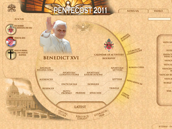
The Roman Church may be semper eadem (ever the same), but will the Vatican website ever change its design? It seems unlikely, despite the ‘redesign’ currently being hailed by Catholic commentators. The website was launched on Christmas Day 1995, and its parchment-look background has always started to look tired after even a few visits, so I’ve been interested to see when it would be dropped.
Sadly, the only thing to change in the current shakeup is the homepage (pictured above, or click here for the real thing), which now looks to me like a Casio sports watch straight out of the 1980s – packed with features that make you ask, where do I begin? I can count no less than 45 links on the page, which is hardly the simple welcome to visitors you would expect from such a heavily visited domain (almost 14,500 websites link into vatican.va).
Most of the other pages in the site look as they’ve always done – narrow columns (of about 600 pixels) packed with brown text which scroll forever with hardly a picture to break the monotony.
Refreshingly, the website is run by a woman, Sister Judith Zoebelein, who is editorial director of the Internet Office of the Holy See. She’s been at the helm since the Vatican went online, and her role as founder of the website was recognised by the Pope earlier this year. He gave her the highest honour possible for a nun: a sign of his esteem for her, of course, but also of his esteem for the Internet.
In a fascinating ad hoc video interview in 2007, Sister Judith spoke to journalists about the vision and practical work that goes into producing the Vatican website. Asked how many people work on it, she replied, ‘Seventeen. Too few, believe me!’
She seems like a sparky, progressive person, so maybe the slow pace of change could be explained by something she also said.
‘We’re trying to integrate something of technology into a 2,000 year-old institution. Sometimes I feel that the echo waves have to go all the way back 2,000 years and then they come back up again and you find the integration or the mix between the technology and the institution. To me that’s been a challenge, but it’s also fascinating.’
It looks like the challenge might currently be winning out over the fascinating.
Comment (0) |
|
|
|
|
|
|
|
|
Crossover design?
Posted on 04 August 2010, 22:24
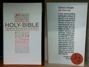
In Blackwells yesterday I came across a paperback edition of the New International Version of the Bible – a veritable brick, bigger than an airport blockbuster. I liked the cover, though (which I snapped, above left), with the type set in the shape of a cross, the lower half being an extended quote from Jesus: ‘Ask and it will be given to you…’
The type, which is a variation of Gill Sans, is physically impressed into the paper, like old-fashioned letterpress, which makes me think the designer has taken a leaf out of the Penguin Great Ideas series, which also features impressed type. Just a few steps away from the bookshelf where I saw the Bible was a copy of the Penguin edition of The Inner Life by Thomas à Kempis (above right), looking like it came out of the same design studio.
Comment (0) |
|
|
|
|
|
|
|
|
Pray without surfing
Posted on 31 July 2010, 4:35
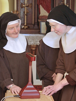
The Poor Clares of York, who live an almost medieval lifestyle, have allowed a quiet invasion of technology into their convent. They’re getting breaking news and personal prayer requests on a new gadget, the Prayer Companion, seen above. The tiny strip of a screen keeps the sisters in touch without distracting them with poker sites and other web temptations.
They’ve christened it Goldie, after Goldsmiths art college, who designed it for them. We’ll be featuring the Prayer Companion soon on Ship of Fools as a Gadget for God, so this is a preview. Thanks to John Smith for emailing the details, and to Goldsmiths for the photo.
Comment (1) |
|
|
|
|
|
|
|
|
Typographic tango
Posted on 16 July 2010, 3:29
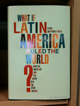
Winner of the Book Cover of the Week competition (Latin section)... as snapped in Foyles on Charing X Road today. Also here.
Comment (2) |
|
|
|
|
|
|
|